

UI/UX Design Guide: Research, Wireframes, Accessibility and Testing
A practical UI/UX design guide covering user research, information architecture, wireframes, responsive interfaces, accessibility, usability testing and developer handoff.
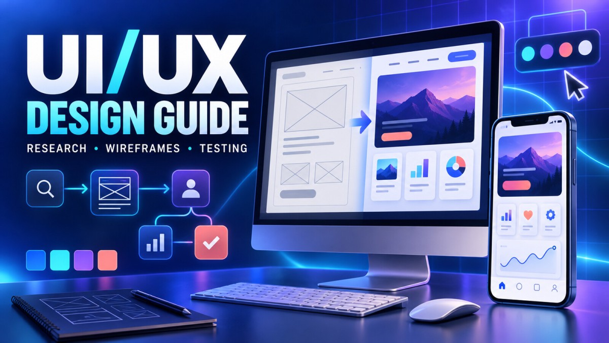
A polished interface can attract attention, but a useful product earns trust by helping people complete real tasks without confusion. UI/UX design brings these two concerns together. User experience (UX) defines how the product works, how information is organised and how smoothly a person moves from intention to outcome. User interface (UI) shapes the visual and interactive layer people see and touch.
This guide explains a practical process for designing websites and mobile apps, from research and information architecture to wireframes, accessibility, testing and developer handoff. It is written for beginners, product owners, developers and designers who want a repeatable method rather than a collection of visual trends.
UI and UX: Related, but Not the Same
UX design focuses on the complete experience around a product. It asks whether the product solves the right problem, whether the flow makes sense, whether users can recover from mistakes and whether the experience remains useful over time. Research, journey mapping, information architecture, task flows, prototyping and usability testing are common UX activities.
UI design translates that structure into a clear visual system. It covers typography, colour, spacing, components, states, icons, motion and responsive behaviour. UI is not decoration added after UX. Visual hierarchy and interaction feedback directly affect whether users understand what to do.
| Area | Primary question | Typical outputs |
|---|---|---|
| UX research | Who has this problem, and why? | Interview notes, evidence, needs and risks |
| Information architecture | How should content and features be organised? | Sitemaps, navigation models and content groups |
| Interaction design | How does a person complete a task? | User flows, wireframes and prototypes |
| UI design | How should the interface communicate and respond? | Layouts, components, states and visual specifications |
| Validation | Can people use it successfully? | Test findings, analytics and prioritised improvements |
Begin With the Problem, Not the Screen
A common mistake is opening a design tool before defining the problem. A screen can look professional while solving the wrong need. Start with a short problem statement that identifies the audience, situation, difficulty and desired outcome.
For example, “Small shop owners need a faster way to create branded festival posts because complex editing tools take too long to learn” is more useful than “We need a poster-maker dashboard.” The first statement leaves room to test different solutions. The second assumes the solution before the need is understood.
Set measurable product goals
Choose a small number of outcomes that connect user value with product value. Depending on the product, useful measures might include successful onboarding, completion of a first project, time required to finish a task, repeat usage, support requests, checkout completion or error rate. Avoid treating screen views alone as proof of a good experience.
Conduct Lightweight User Research
Research does not always require a large budget. The goal is to replace assumptions with evidence. Speak with people who resemble the intended audience, observe existing workflows and review the language used in support requests, search queries, reviews and sales conversations.
Useful research methods
- User interviews: Learn about goals, habits, constraints and previous attempts. Ask for real examples rather than hypothetical opinions.
- Contextual observation: Watch people complete a task in their normal environment. Interruptions, devices and workarounds often reveal needs that interviews miss.
- Support and review analysis: Group repeated complaints, questions and praise into themes.
- Competitor review: Study common patterns, gaps and user expectations without copying layouts or language.
- Analytics review: Look for abandonment, repeated errors and unexpected paths, then investigate the reason through qualitative research.
Recruit participants based on behaviour and need, not only age or job title. Five people with the same relevant task may produce more useful insight than a large group with no connection to the problem. Small studies do not prove population-wide preferences, but they can expose serious usability barriers early.
Turn Evidence Into Clear Requirements
Summarise research into a small set of user needs, business constraints and open questions. Personas can help when they are grounded in evidence, but fictional biographies and decorative stock photos add little value. A concise job statement is often enough: “When I receive a new order, I want to create and share a branded product post quickly so I can promote it while interest is high.”
Prioritise requirements using impact, evidence, effort and risk. Separate essential tasks from attractive extras. A new user must be able to understand and complete the core task before advanced customisation matters.
Map the Journey and Information Architecture
A journey map shows the stages around a task, including what happens before and after the interface. A user may discover a product through search, compare alternatives, sign up, learn the workflow, complete a task, return later and seek help. Mapping these stages reveals gaps between marketing promises and product reality.
Information architecture defines where content and functionality live. Group items according to users' mental models, give navigation labels plain names and avoid placing the same function in several confusing locations.
Practical information architecture checks
- Can a first-time visitor explain the main sections after scanning the navigation?
- Are labels based on user language instead of internal department names?
- Does every page have a clear purpose and parent section?
- Can important content be reached in more than one reasonable way when appropriate?
- Does search return useful results for common wording and spelling variations?
- Are empty states and missing results helpful rather than dead ends?
Design Task Flows Before Detailed Screens
A task flow shows the steps required to reach one outcome. Start with the happy path, then add realistic alternatives: invalid input, no internet, denied permission, unavailable inventory, failed payment, expired session, cancellation and recovery.
Keep each decision understandable. If a flow branches repeatedly, ask whether the product is requesting information too early or exposing internal complexity. Progressive disclosure can keep advanced choices available without overwhelming everyone.
For high-risk actions such as payment, deletion or account changes, show the consequence before commitment and provide confirmation or recovery where appropriate. Error prevention is usually better than an error message after damage occurs.
Use Wireframes to Solve Structure
Wireframes are intentionally simple representations of layout and hierarchy. They help teams discuss content, order, navigation and actions without becoming distracted by colour or visual polish.
Begin with rough sketches for speed. Move to digital low-fidelity wireframes when the direction is clearer. Include realistic content lengths because perfect placeholder text can hide wrapping, translation and hierarchy problems.
What every wireframe should communicate
- The purpose of the screen
- The primary and secondary actions
- The order in which information should be read
- Navigation and back behaviour
- Empty, loading, success and error states
- What changes on small and large screens
A wireframe is not successful because stakeholders approve it. It is successful when it provides a clear, testable explanation of how the experience should work.
Build Prototypes at the Right Fidelity
A prototype simulates enough behaviour to answer a question. Low-fidelity prototypes are useful for comparing flows. Higher-fidelity prototypes help evaluate visual hierarchy, copy, component behaviour and transitions. Building every screen at maximum fidelity wastes time when the basic workflow is still uncertain.
Define the question before prototyping: Can users find the pricing information? Do they understand how to export? Can they recover from an invalid form? The answer determines which screens and interactions need to be included.
Create Strong Visual Hierarchy
Visual hierarchy helps people understand importance and sequence. Size, weight, contrast, spacing, alignment and placement should work together. If every card, colour and button demands attention, nothing feels primary.
- Use one clear primary action per task stage.
- Create a predictable type scale for titles, headings, body text and labels.
- Use spacing relationships consistently instead of adjusting every gap by eye.
- Reserve strong colours for meaningful emphasis and state.
- Keep line lengths comfortable and paragraphs scannable.
- Use icons with labels when the meaning may not be universally understood.
Whitespace is not unused space. It separates groups, reduces visual noise and improves scanning. Dense interfaces can still be clear when spacing follows a consistent rhythm.
Design Components and All Their States
A button is more than a coloured rectangle. It may need default, hover, focus, pressed, disabled and loading states. Form fields need labels, helper text, validation, error and success behaviour. Cards, menus, dialogs, tabs and notifications also need complete specifications.
A design system documents reusable components, tokens and guidelines. Start small with colour roles, typography, spacing, elevation, icons and common controls. Add components when repeated product needs justify them. A system should improve consistency and speed without preventing teams from solving new problems.
Name tokens by purpose, such as “text-primary” or “surface-error,” rather than by a fixed colour name. Purpose-based naming makes themes and future visual changes easier to manage.
Plan Responsive and Mobile Experiences
Responsive design is not shrinking a desktop screen. Content priority, input method, available space and context can change across devices. A wide data table may become a card list, a persistent sidebar may become a menu and secondary actions may move behind an overflow control.
Design important breakpoints based on when the content stops working, not only on popular device widths. Test narrow screens, large text, long translations, landscape orientation, touch input, keyboard input and zoom.
Mobile design checklist
- Keep primary actions reachable and clearly labelled.
- Avoid placing destructive actions beside frequent actions.
- Provide enough target space and separation for touch.
- Do not depend only on hover.
- Preserve user input during rotation, interruption or temporary network failure.
- Use native conventions when they improve familiarity and accessibility.
- Explain permission requests when the reason is not obvious.
Treat Accessibility as a Core Requirement
Accessibility should be considered during research, design, development and testing—not added at the end. The W3C organises WCAG guidance around four principles: content should be perceivable, operable, understandable and robust. WCAG 2.2 is the current W3C Recommendation for web content, and teams should check the latest applicable requirements for their product and region.
Essential accessibility considerations
- Use sufficient contrast and do not communicate meaning through colour alone.
- Provide text alternatives for meaningful images.
- Maintain logical heading structure and reading order.
- Make functionality available by keyboard and show a visible focus indicator.
- Provide clear labels and instructions for inputs.
- Write error messages that identify the problem and suggest recovery.
- Support text resizing and reflow without hiding essential content.
- Offer captions or alternatives for relevant media.
- Avoid unnecessary flashing and give users control over motion where needed.
- Ensure controls expose meaningful names, roles and states to assistive technology.
Automated scanners can find some issues, but they cannot determine whether a flow is understandable or whether alternative text is useful. Combine automated checks with keyboard testing, screen-reader checks and evaluation by people with disabilities whenever possible.
Write Interface Content That Guides Action
UX writing includes labels, instructions, buttons, empty states, confirmations and errors. Use familiar words, put important information first and keep terminology consistent. A button labelled “Continue” may be vague when “Review order” or “Create account” describes the next result.
Error messages should be specific and respectful. “Enter a valid 10-digit mobile number” helps more than “Invalid input.” Avoid blaming the user. Preserve correct data and place the message close to the field that needs attention.
Empty states should explain why there is no content and what useful action can be taken next. Loading states should set expectations without pretending to know a completion time.
Use Motion and Micro-interactions With Purpose
Micro-interactions provide feedback about a small event: a saved bookmark, a completed upload, a changed setting or a validation result. Motion can clarify spatial relationships and state changes, but it should not delay work or compete with content.
Keep animations brief, predictable and interruptible. Respect reduced-motion preferences where applicable. Never rely on animation alone to communicate success or failure.
Design Forms for Completion, Not Collection
Every field creates effort and an opportunity for failure. Ask only for information needed at the current stage. Use persistent visible labels instead of placeholder-only labels, choose appropriate input types and allow paste and password-manager support.
Group related fields, explain unusual requirements before submission and validate at a helpful moment. For sensitive or consequential actions, provide a review step and make the final action unambiguous. If a submission fails, keep entered information whenever safe.
Test With Real Tasks
Usability testing evaluates behaviour rather than design preference. Give participants a realistic goal and observe what they do without guiding every step. Ask them to think aloud when that method suits the study, and follow up after the task to understand expectations and confusion.
A simple moderated test plan
- Define the product question and participant criteria.
- Prepare three to five realistic tasks.
- Test the prototype and instructions before sessions begin.
- Record completion, major errors, hesitation and participant comments.
- Separate observations from interpretations.
- Group repeated problems and rate them by severity.
- Improve the design and retest the important changes.
Do not ask leading questions such as “Was the checkout easy?” Ask “What did you expect to happen?” or “How would you complete this purchase?” A successful test is one that reveals what to improve, not one that proves the design was right.
Measure the Experience After Launch
Launch is the beginning of learning. Combine behavioural metrics with user feedback. Conversion can improve while trust or retention declines, so review the complete journey.
| Stage | Useful question | Example signals |
|---|---|---|
| Discovery | Are the right people arriving? | Traffic sources, search intent, campaign quality |
| Onboarding | Do users understand the first steps? | Completion, exits, support questions |
| Core task | Can users reach the main outcome? | Task completion, time, errors, retries |
| Retention | Does the product remain useful? | Return usage, repeated value actions |
| Quality | Are technical problems blocking people? | Crashes, latency, failed requests |
| Satisfaction | How do users describe the experience? | Interviews, surveys, reviews, support themes |
Annotate releases, campaigns and outages before interpreting trends. A metric shows what happened; it rarely explains why. Use research to investigate significant changes.
Prepare a Clear Developer Handoff
Good handoff is an ongoing collaboration, not a final file transfer. Discuss technical constraints early and review implemented components before the feature is complete.
- Provide responsive layouts and component states.
- Define spacing, type, colour and behaviour through shared tokens.
- Document loading, empty, error, offline and permission states.
- Include realistic content and edge cases.
- Explain keyboard order, focus behaviour and accessibility labels.
- Identify reusable components and approved exceptions.
- Review the built product on actual devices and screen sizes.
Design files can describe intent, but they do not replace conversation, acceptance criteria or quality assurance.
A Practical Four-Week UI/UX Workflow
Week 1: Understand
- Define the problem, audience and measurable outcome.
- Review existing evidence and conduct focused research.
- Map the current journey and identify high-risk assumptions.
Week 2: Structure
- Organise content and create task flows.
- Sketch alternatives and build low-fidelity wireframes.
- Review feasibility with product and engineering.
Week 3: Prototype and test
- Build only the fidelity needed to answer key questions.
- Run usability and accessibility checks.
- Prioritise findings and revise the flow.
Week 4: Detail and handoff
- Apply the visual system and complete component states.
- Document responsive behaviour and edge cases.
- Review implementation and define post-launch measures.
Common UI/UX Design Mistakes
- Starting with visual trends before understanding the problem
- Treating personal preference as user research
- Designing only the ideal happy path
- Using placeholder content until late in the project
- Hiding labels inside form fields
- Using colour alone to explain status
- Creating custom patterns where familiar controls would work better
- Testing only with team members
- Ignoring loading, empty, error and offline states
- Measuring clicks without measuring successful outcomes
Pre-Launch UI/UX Checklist
- The primary audience, problem and success measure are documented.
- Core tasks can be completed without unnecessary steps.
- Navigation labels and actions use clear language.
- Responsive layouts work with realistic content and large text.
- Keyboard, focus, contrast, labels and screen-reader basics are checked.
- Every key component includes its relevant states.
- Errors explain recovery and do not erase safe user input.
- High-risk actions communicate consequences.
- Usability findings are prioritised and critical issues are retested.
- Analytics measure meaningful outcomes with appropriate privacy controls.
Frequently Asked Questions
Do I need separate UI and UX designers?
Not always. Small teams may have one product designer covering research, flows and interface design. The important point is that both the behavioural experience and the visual interface receive deliberate attention.
Which should come first: UI or UX?
Begin with the user problem, requirements and flow. Visual design can develop alongside the structure, but detailed polish should not hide unresolved workflow problems.
How many users are needed for usability testing?
There is no universal number. Use enough relevant participants to answer the current question, look for repeated high-impact problems and run additional rounds as the design changes.
Is a design system necessary for a small product?
A large documentation site may not be necessary, but even a small product benefits from shared colours, typography, spacing and reusable component states.
Does passing an automated accessibility test make a product accessible?
No. Automated tools detect only certain technical issues. Manual checks and testing with assistive technologies and people with disabilities provide essential additional evidence.
Should mobile and desktop screens look identical?
No. They should feel consistent and support the same core purpose, but layout and interaction can adapt to screen space, input method and context.
Final Takeaway
Effective UI/UX design is a cycle of understanding, structuring, prototyping, testing, implementing and learning. Attractive screens matter, but clarity, accessibility, recovery and task success matter more. Begin with evidence, make important decisions testable and improve the product using both user feedback and real behaviour.
Useful Official References
- W3C Web Content Accessibility Guidelines (WCAG) 2.2
- Apple Human Interface Guidelines: Accessibility
- Material Design: Accessible Design
Disclaimer: This article provides general educational guidance. Accessibility obligations, platform guidance and technical standards can change and may vary by product, industry and location. Review the latest official requirements and obtain specialist advice when compliance decisions carry legal or safety consequences.
What's Your Reaction?
 Like
0
Like
0
 Dislike
0
Dislike
0
 Love
0
Love
0
 Funny
0
Funny
0
 Wow
0
Wow
0
 Sad
0
Sad
0
 Angry
0
Angry
0

Software developer with expertise in full-stack web development and financial market analysis, specializing in building tracking tools for trading metrics.









Comments (0)